
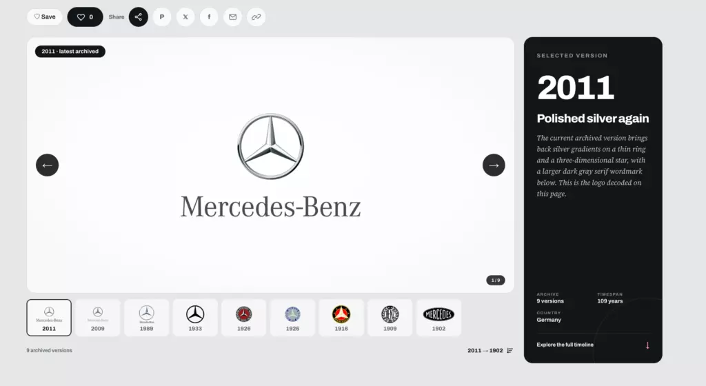
Pull up a car ad from 2010 and look at the logo. Chances are it shines. There is chrome, a soft shadow, maybe a blue gradient that makes the badge look like it was carved from glass. Now pull up the same brand’s website today. The logo is probably a thin line drawing in black or white, with no shine at all.
This change did not happen by accident, and it did not happen slowly. Within about three years, many of the world’s biggest carmakers redrew the symbols they had polished for decades. Here is the story of how car logos went flat, and why so many brands made the move at almost the same time.
The age of chrome on paper
For most of the 20th century, a car logo was a physical object first. It was a metal badge on a grille, a trunk lid or a steering wheel. When brands put that badge into print ads or TV commercials, they tried to make it look like the real thing: shiny, heavy and expensive.
The early 2000s pushed this even further. Computer graphics made it easy to add gradients, reflections and bevels. Many carmakers updated their logos to look like polished 3D objects, even on a flat page. Chrome on paper became the standard look of the industry.
Tech went flat first
The shift started outside the car world. In 2012, Microsoft launched Windows 8 with its tile-based design built on solid colors and simple shapes. A year later, Apple released iOS 7 and dropped the glossy, realistic icons the iPhone had used since the start.
Almost overnight, the shiny look began to feel dated. Websites, apps and tech brands adopted clean, flat graphics that loaded fast and looked sharp on any screen. Car companies were slower to follow. Their logos were tied to physical badges and decades of heritage. But the pressure kept building.
 The automotive wave: 2019 to 2022
When the change finally reached the car industry, it came fast. Volkswagen moved first among the giants. In 2019 it revealed a two-dimensional VW logo alongside the ID.3, its first car on a new electric platform. BMW followed in 2020 with a flat roundel and a transparent outer ring, created mainly for marketing and digital use. That same year Nissan introduced a thin, flat emblem on the Ariya electric SUV.
The year 2021 was the busiest of all. General Motors swapped its familiar blue square for a lowercase “gm” in a rounded frame, part of a big push toward electric cars. Kia replaced its oval badge with a sharp, connected wordmark. Renault unveiled a flat diamond made of thin lines, and Peugeot returned to a lion head inside a shield. Citroën joined the wave in 2022 with a new oval based on its original chevrons.
The timing was not random. Most of these launches came alongside a new electric model or a new brand strategy. A fresh logo was a quick way to tell the public that the company was changing.
| Brand | Year | Launch Context | Design Change |
|---|---|---|---|
| Volkswagen | 2019 | ID.3 electric platform | Two-dimensional VW logo |
| BMW | 2020 | Digital and marketing use | Flat roundel with transparent outer ring |
| Nissan | 2020 | Ariya electric SUV | Thin, flat emblem |
| General Motors | 2021 | EV strategy push | Lowercase “gm” in rounded frame |
| Kia | 2021 | Brand relaunch | Connected wordmark replacing oval |
| Renault | 2021 | Brand strategy refresh | Flat diamond of thin lines |
| Peugeot | 2021 | Heritage revival | Lion head inside shield |
| Citroën | 2022 | Heritage-inspired refresh | New oval based on original chevrons |
Why carmakers made the switch
The first reason is simple: screens took over. Most people now meet a car brand on a phone long before they see a car in a showroom. A detailed chrome logo turns into a grey smudge when it shrinks to the size of an app icon or a social media avatar. A flat design stays sharp at any size and works in both light and dark mode.
Cars themselves also became screens. Modern dashboards greet the driver with a startup animation, and the brand’s own app controls charging, climate and door locks. A simple logo is far easier to animate and display across all of these surfaces.
Then there was the move to electric power. Many EVs have no traditional grille, so the old badge-on-a-grille layout no longer fit. Brands also wanted to signal a clean break from the combustion past, and a new, lighter logo did that in a single image.
Lighting and sensors played a part too. Flat shapes are easier to turn into illuminated badges, which several brands now offer. A smooth front emblem also suits the radar sensors that many modern cars hide right behind the badge.
Finally, a flat mark looks the same everywhere: on a website, a dealership sign, a key fob or a T-shirt. That consistency saves money and makes the brand easier to recognize in every place customers see it.
New look, old roots
Here is the twist: flat logos are not really new. Before the chrome era, many car emblems were simple, flat shapes printed in one or two colors. Renault’s 1972 diamond, designed with the help of artist Victor Vasarely, was built from clean lines. Citroën’s first chevrons from 1919 were a plain graphic mark. Peugeot’s 1960s lion was bold and simple.
That is why several of the recent redesigns look backward as much as forward. Brands went searching through their own archives and found that the cleanest version of their logo had been there all along. If you want to see this for yourself, try to compare old and new car logos brand by brand. The 2020s versions often look closer to the 1960s and 1970s than to the 2000s.
The criticism
Not everyone is happy. Critics argue that flat design makes brands look alike. When every logo is a thin line in black or white, some of the personality disappears. Kia’s 2021 wordmark is a well-known example of the risk: many people read it as “KN” instead of “KIA.”
It is also worth noting that the physical badge on the car did not always change as much as the marketing logo. BMW, for example, introduced its flat transparent roundel mainly for advertising and digital use, while cars kept a solid badge for years. In many cases, the flat logo lives online and the chrome one still lives on the hood.
Car logos went flat because the world around them went digital. Phones, apps, dashboards and electric cars all demanded a simpler symbol, and carmakers delivered it in a rush between 2019 and 2022. In many cases they did not invent anything new. They simply stripped away the chrome and went back to the clean shapes their founders had chosen in the first place.


1 Comment. Leave new
🎨 The Paradox of Invisibility: Why Flat Logos Are a Symptom, Not a Strategy
The rush to flatten car logos between 2019 and 2022 is usually framed as a design story. It is not. It is a story about where brand value now lives. When a logo must survive as a 16-pixel favicon, a startup animation on a 15-inch dashboard screen, and an illuminated emblem behind which radar sensors hide, the old chrome badge becomes a liability. The flat logo is not a statement of taste; it is a functional requirement of the digital touchpoint. The carmakers who moved fastest—Volkswagen, BMW, General Motors—were not chasing a trend. They were acknowledging that the primary encounter with their brand now happens on a screen, not on a grille.
But there is a deeper irony. The article notes that many of the new logos look backward to the 1960s and 1970s, stripped of the chrome that defined the 2000s. This is not nostalgia; it is a strategic simplification. As cars become increasingly similar in their electric architecture—shared platforms, shared battery suppliers, shared aerodynamic shapes—the logo carries more of the differentiation burden than ever before. Yet by making every logo a thin monochrome line, brands risk achieving the opposite: a sea of indistinguishable marks. Kia’s “KN” problem is not a one-off error; it is a warning about the limits of minimalism when applied universally. The brands that will win the next decade are those that can maintain distinctiveness within the flat constraint—through typography, color, motion, or a shape so distinctive it survives even at 16 pixels.
The Takeaway: Flat logos did not make car brands boring. They revealed which brands were already boring. In a world where the badge is no longer a chrome sculpture on a hood but a line drawing on a screen, the real differentiator is not the logo itself—it is the experience behind it. The logo is just the door. What matters is what is inside.
Hashtags: #FlatDesign #CarLogos #BrandIdentity #AutomotiveDesign